


01
Exploring Us.
Exploring Us.

02
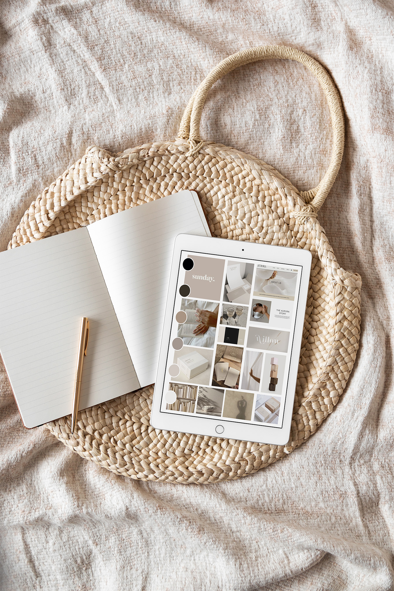
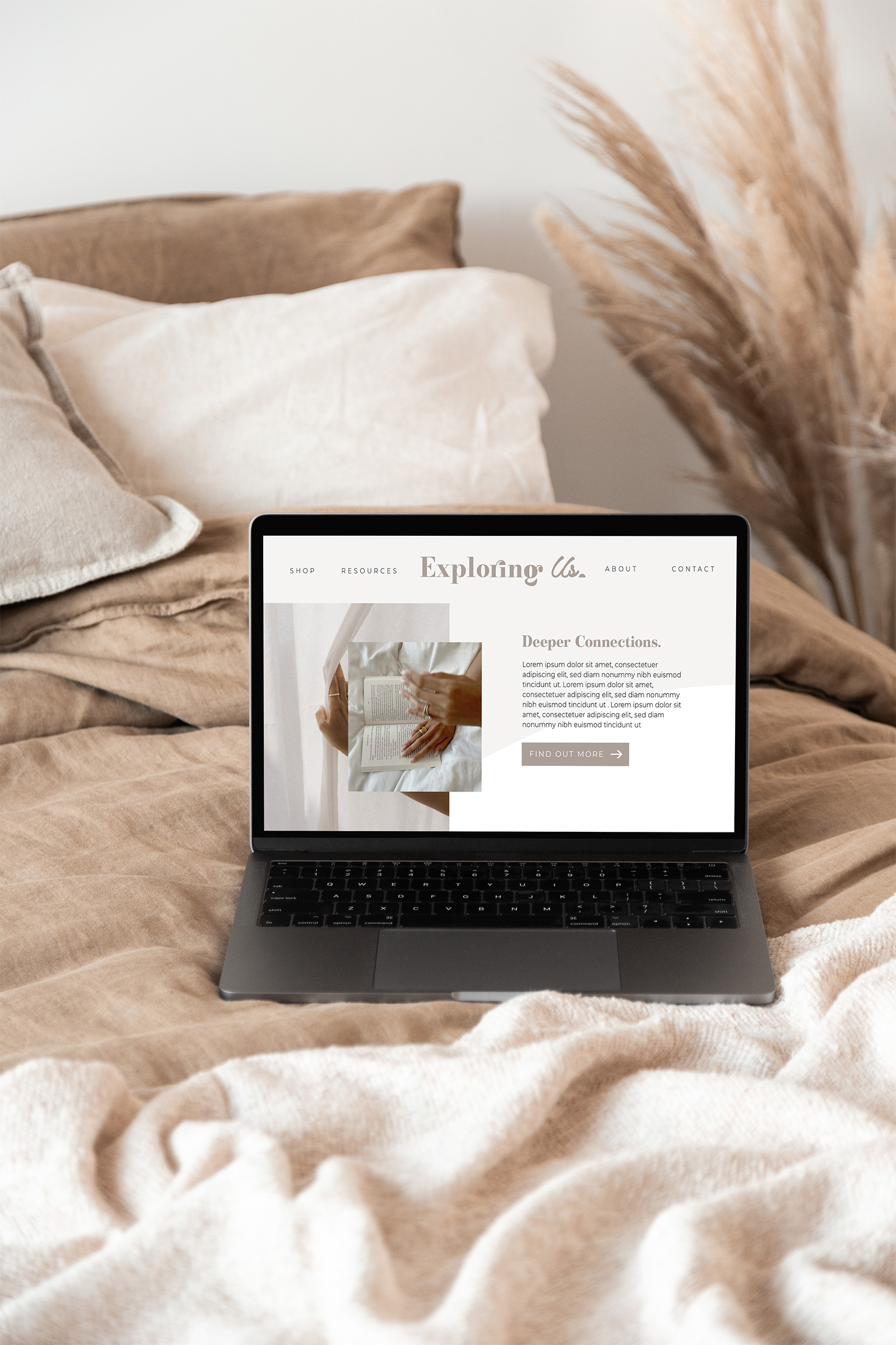
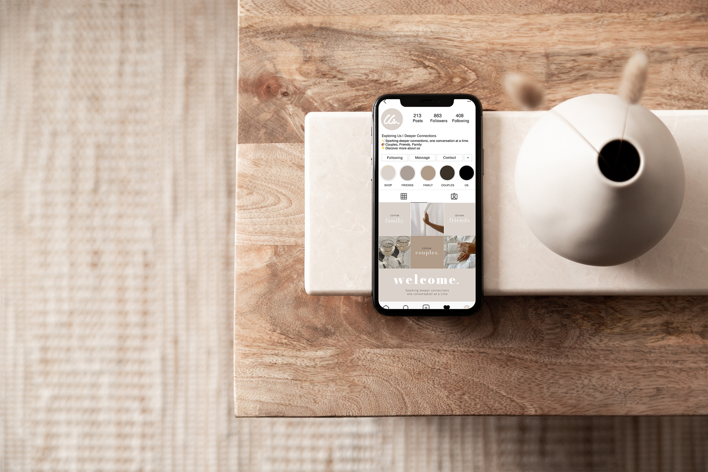
Brand Identity
A brand built to spark real conversations. Warm, modern and crafted to feel as good on a shelf as it does in your hands. Exploring Us needed a visual identity as inviting as the conversations it starts. We developed a brand system built around warmth, playfulness and connection with a considered colour palette, soft but confident typography and a logo mark that nods to togetherness. The result is a brand that feels premium without feeling out of reach and works beautifully whether it's on a box, a card or a social post.
03
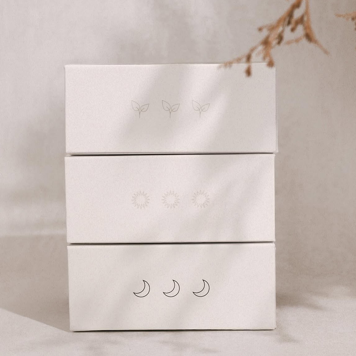
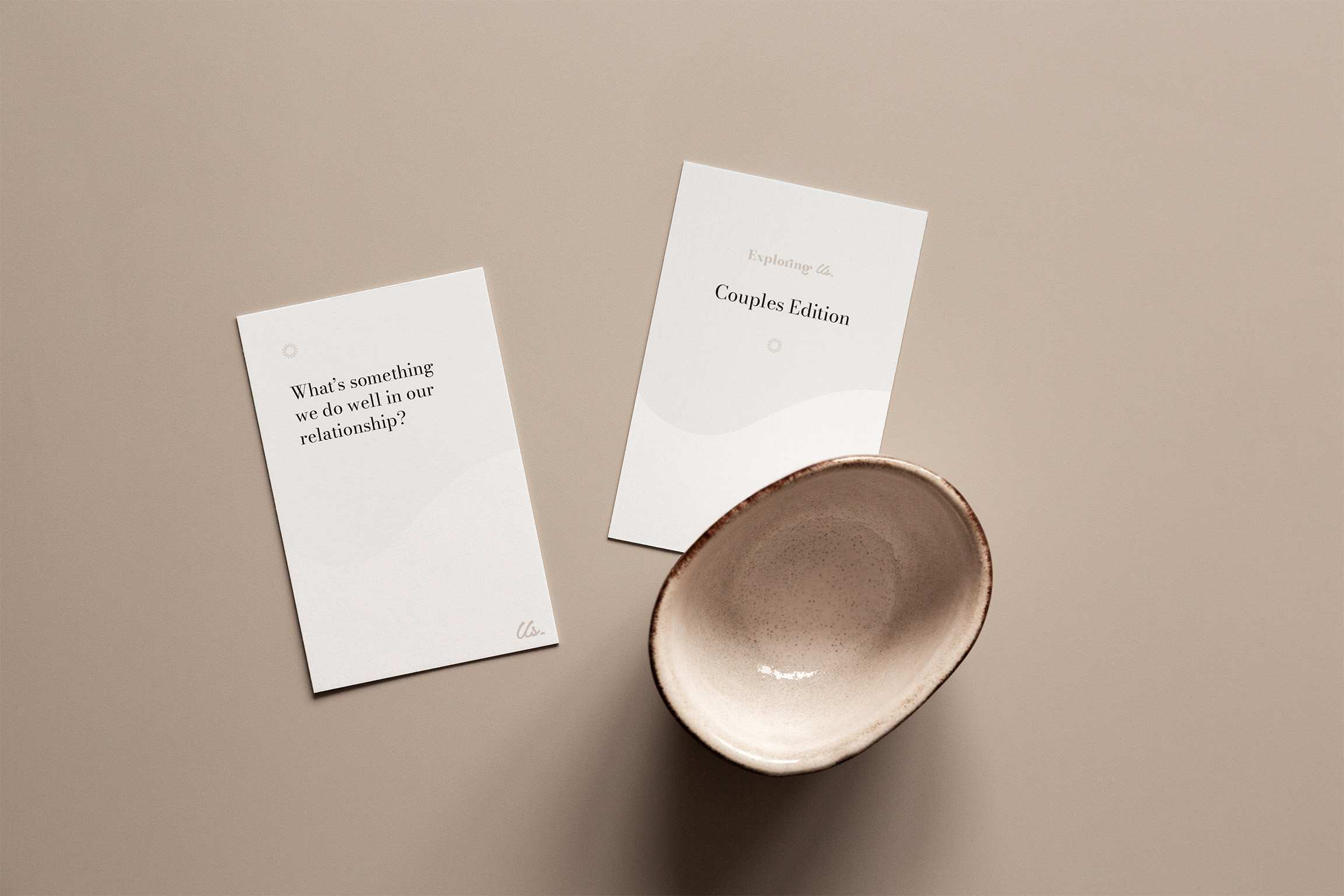
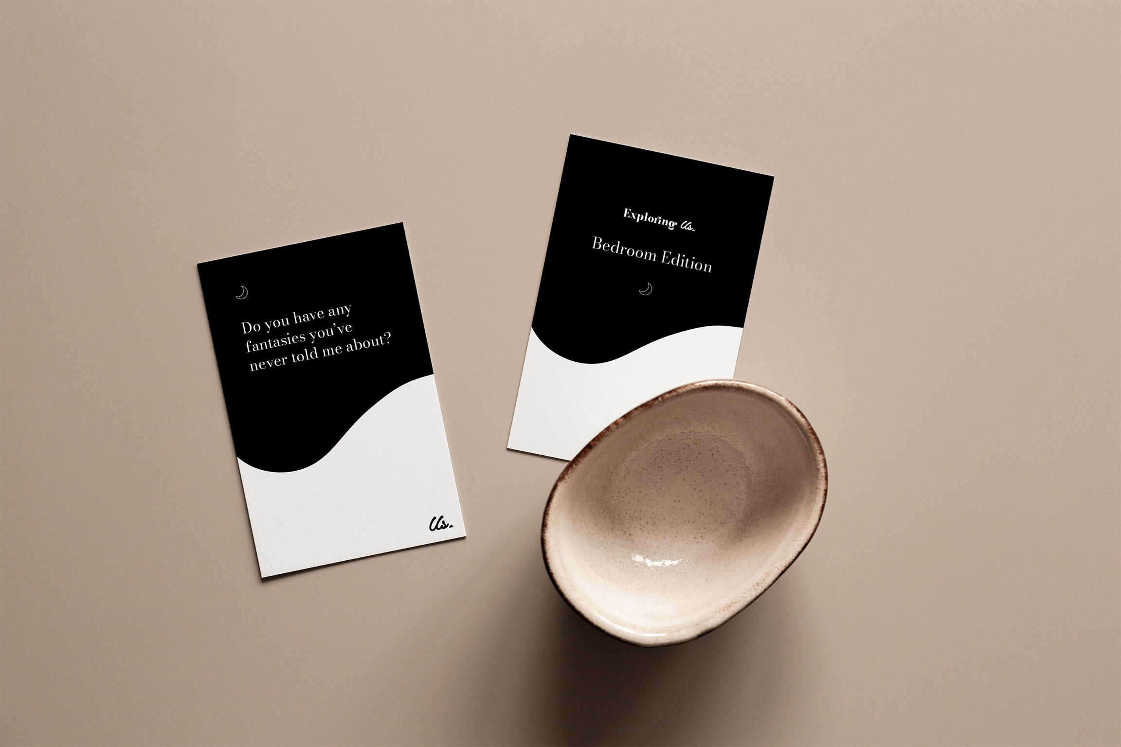
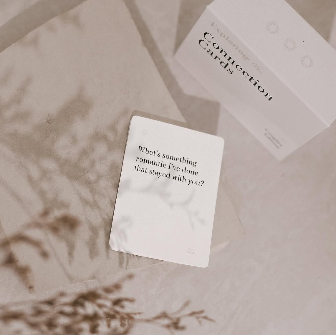
Packaging Design
Packaging that stops the scroll and earns its place on the shelf. Designed to feel like a gift worth giving and keeping. Packaging is the first brand experience for Exploring Us customers so we made it count. Each edition was designed with a distinct but cohesive look: rich, tactile finishes, considered typography and a colour story that made the product range feel like a collection. From the box structure to the card stock treatment, every detail was designed to feel like something worth gifting, unwrapping and coming back to.